May 28, 2024

The web has become increasingly mobile, and that has major implications for everything you do online.
All of your content, like Chinese take-out, should now be packaged "to go."
What does that mean?
- Visual. All of your content should be more visual (you know, like a Chinese combo plate menu)--from social media to website.
- Responsive. Your website should be mobile-friendly. Otherwise 25%-40% of your visitors may leave frustrated because they can't even read your content.
- Short. Article titles, email subject lines, and any key message should be short & sweet. Paragraphs of thick text are a thing of the past.
- Social Media Optimized. Any content on your website should move effortlessly across the web with a click. For example your social "share" buttons package it up and serve it on Facebook complete with photo, title & blurb.
Your biggest online communication challenge is now to boil everything down to short messages (not unlike a fortune cookie) and powerful visuals.
But How? Upleaf has compiled some useful resources to help you flourish in this age of mobile and visual messaging. Check the links above and read on.
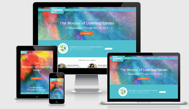
Responsive Design
Instead of your website looking itty-bitty and hard to read on a phone, it should adjust to the small screen and highlight what's most important. This design technique adapts to every screen size, and gets great results.
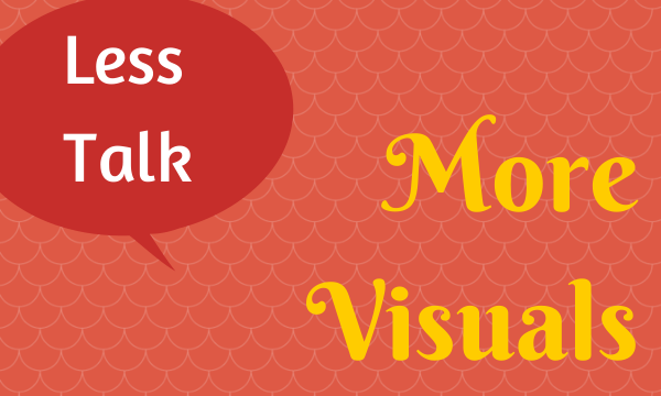
Visual Content Tools
Visual content gets more likes, clicks, shares across the web. See our tips on how to make your photos, images, infographics and more stand out - and some low-cost tools to help you create them.